On the wettest and gloomiest day of last week I went to Alderton to visit another of the 100 churches mentioned in my book.
Apologies for the quality of the photos - it was just too grey and wet to get anything decent.
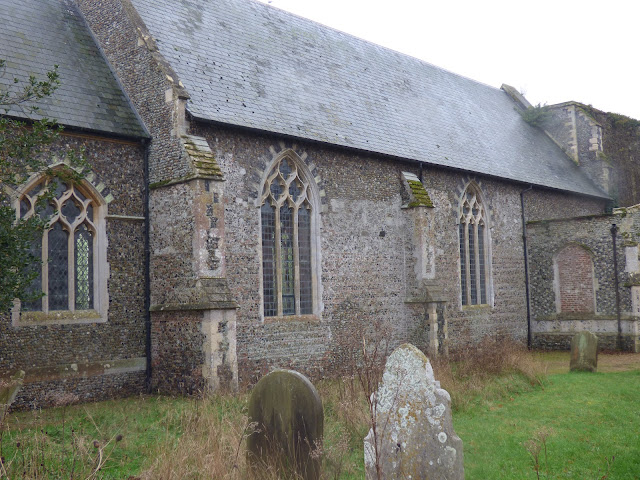
Difficult to get a photo of the whole of the outside of the church, and I wasn't going to keep trying different shots in the rain!
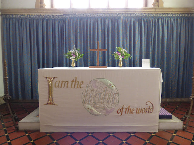
This church is featured in the 100 treasures book for its alter frontal. Designed by Lida Lopes Cardoza Kindersley and made by Maureen Rasmussen in 2004, it's theme is 'the light of the world' and the fish symbolise St Andrew.
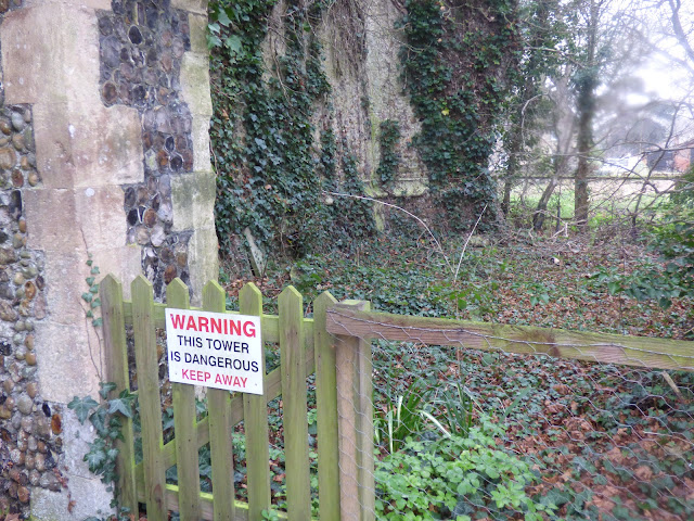
But I think it should get a mention for the tower which finally collapsed in 1821, supposedly killing a cow. I assume the cow was in the churchyard rather than inside the tower!
leaving this amazing ivy covered ruin, surrounded by fencing and trees
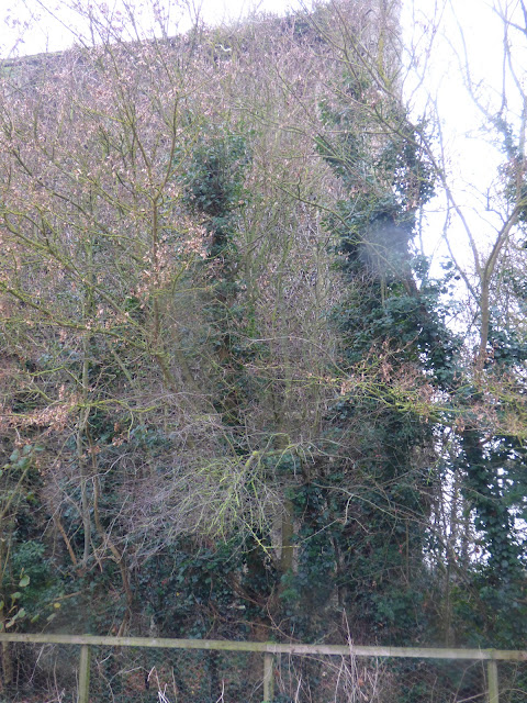
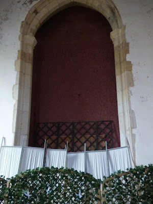
From inside the remains of the tower have been bricked up and painted. It's all rather odd.
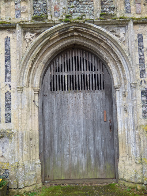
The oldest part of the original church is the medieval porch
with it's very old door
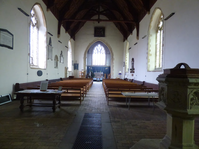
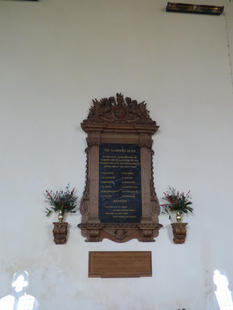
Inside the church, apart from the altar frontal, there doesn't seem to be much of interest. No stained glass, the font is ordinary but the war memorial is well carved
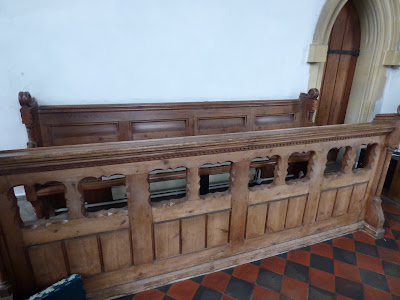
And these old choir stalls are interesting
Not the most interesting church I've visited.

That's a really old door, how amazing that it's still there and hasn't rotted away.
ReplyDeleteI love that door!!
ReplyDeleteI'd love the ruins too, if one could get to them, but I do understand that they are probably pretty dangerous.
The altar frontal is stunning.
xx
The embroidered altar cloth is stunning, but the rest of the building sadly seems just... dull
ReplyDeleteEven if a church is dull though they are fascinating. The things acquired over the years to embellish them. I can't see what is depicted in the roundel, but wondered if it was Holman Hunt's 'Light of the World'?
ReplyDeleteThose pictures seem really sad, like the church is worn out and fading away. The altar front is amazing, though.
ReplyDeleteIt looks a very tired and worn out building, a shame really as with a bit of TLC it could be stunning. Other churches, which have had a little care bestowed on them, are brought back to life again.
ReplyDeleteIt seems neglected to me and lacking colour not only from stained glass, but some fresh flowers too. Silly to say that I feel sorry for it the same way as when a boat has been scuttled.
ReplyDeleteThis church does seem a bit 'tired' but the door s gorgeous and makes you wonder how lovely it may have been originally. Just ate our dinner watching Andy Murray loose his game at the Aussie open. It would have been nice for him make it a bit further! The weather is warming up here over the next few days.
ReplyDeleteOne of my fav churches there…of course…Shakespeare’s burial
ReplyDeleteTaught so many years and loved showing students photos…another I mentioned before was close to the art museum…I love love love England and love London…
Shakespeare at Stratford upon Avon of course…
ReplyDeleteI like the simplicity of the benches in this church, much more bench-like than pew-like in my opinion. But I bet it's cold to sit in there for a service or astronomical to heat.
ReplyDeleteWhat an amazing church, and in stricking contrast to the one you wrote about last month at Grundisburgh, a few miles down the road. I love the altar cloth.
ReplyDeleteThank you. I enlarged the war memorial pix as that is my field of work and found my family name on there. I knew that line came from Suffolk and so nice to see it. I wish you had a site like we do in Canada recognizing all those who gave their lives for their country.
ReplyDeleteHave you tried the Commonwealth War Graves Commission website?
DeleteThe alter cloth is beautiful. I love the ivy covering the old remains of the tower and that door. Wow.
ReplyDeleteGod bless.
The contrast among churches is quite striking. This one seems very basic and not as embellished as others. The altar is lovely and the original door is also very remarkable. I suspect the church is still much loved by the community and that's what is important.
ReplyDeleteI'm delighted by the Altar Frontal - and especially because the designer and Embroiderer (they like to be titled "Fabric artist" these days but I think Embroiderer is such an ancient and beautiful title) was named. Thank you for taking us along.
ReplyDeleteFor a gloomy day the photos turned out nicely! The ivy is really lovely!
ReplyDelete